Friday, December 21, 2018

Midterm Project Submission


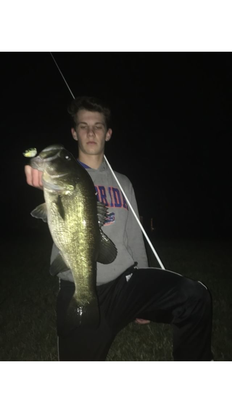
       For my title page, I used a picture of the biggest bass my friends and I caught while at the photo shoot. I used teal and blue for the fonts because it blends with the moon coming out in the background along with standing out enough to catch the audience's attention. For my table of contents, I used a blue background and a salmon-pink font to blend with and match the picture on the top half of the page. In the article, I put two pictures in opposite corners on both pages. This creates a creative template for the words to fit into. The words almost create a zig-zag movement on both pages to keep the page looking interesting. The font for the title is castellar and the article is bodoni MT. I made the title of the article green and everything else black and white to keep it nice and simple.

Flat Plan

    The flat plan for my magazine was mostly based off the magazine BassMasters. I did this because this magazine is very well known and respected when it comes to fishing magazines. This magazine usually had anywhere from 2-6 ads in between articles. I did the same since it spaced the magazine out perfectly. The magazine also gave me article ideas such as fishing fails and other things.

Photo Shoot

      The next day on the 10th of December, I went fishing in my neighborhood, Paddocks North, in the late evening. We went fishing from about 4pm to 8pm and caught most of the fish when it was almost dark. Again I went with my friends Nick, Pearson, and Karson. We all caught many fish and this time we used top water lures. This is great we used this tactic because this will be mentioned in my two page article for the magazine. It was very easy for me to fish this spot since it was a spot I grew up fishing at and it's a walk across the street. I also got a great picture of the sunset with a dock in the background that I will most likely use for my table of contents page.
 

Photo Shoot

     This past Sunday, the 9th of December, I went to the neighborhood Bent Tree to try and catch some fish and take some pictures. This day we used soft plastics to flip and pitch into the cover. This is a tactic I will be elaborating on in my article. I was with some of my friends I fish with all of the time. They're names are Karson, Nick, and Person and they know loads about bass fishing in Sarasota. I went there at 12:00 pm and fished until about 4:00 pm. During this time we caught a great amount of fish. Ranging from small to giant, I got a couple of pictures of some quality fish for my magazine. All these fish were large mouth bass which is the species that article will be about. I knew this spot would produce in a small time period for me to get some content.


Thursday, December 20, 2018

Table of Contents Template

      When making the table of contents template, Erik thought of the design based off of the fishing magazines that Erik researched. I chose the fonts to use this time. We will insert a picture on the top half of the page and the actual table of contents on the bottom. For the table of contents title we used word art in the font high tower text which is in the middle of the page under the image. This font pops out and let's the reader know what thy are about to be reading. The titles for the features were in the font Goudy Old Style in size 22. This font is simple and easy to read so people can know what to expect when reading the rest of the magazine. The date and page number is in the bottom left corner in the font Book Antiqua in size 16.

Monday, December 10, 2018

Scouting Location #2

  For the second scouting location, I chose to fish at a neighborhood called Bent Tree which is also located east of the interstate in Sarasota, Fl, close to my first spot. The advantage of this location is that there are an abundance of great fishing ponds to take pictures at. I have had experience fishing here before and know the are like the back of my hand. This will allow me to save time since I will know right where to start fishing.

Tuesday, December 4, 2018

Scouting Location #1

    The first of my two locations is located where I live. The neighborhood is named Paddocks North and is located east of the interstate in Sarasota, Fl. In this neighborhood there is a small pond in the middle of the houses that is loaded with giant large mouth bass. This will allow me to catch some quality fish for the images for the magazine. Also the fish are very easy to catch which will allow the magazine to be produced at a faster rate.

Monday, December 3, 2018

Cover Template

       For the title page template, we used word art for the title and the slogan for the magazine. Erik chose the fonts for this age while I created the temple and setup for the information. The font for the title is Trajan Pro 3 in size 36 font and in bold and says, "Sarasota Sportsman."The tite was based off of a very popular fishing magazine named Florida Sportsman.  The reason we chose this font was because it is sharp but not too sharp which helps create an outdoors feel. For the slogan we used consolas in size 20 font. The slogan says, "Sarasota's Best Informational Fishing Magazine." This is a muted and curvy font to offset the sharp title font. For the sub headings we used Tekton Pro Ext because it is soft and easy to read. This allows the audience to have an idea for the main articles.

Tuesday, November 27, 2018

Research

          Finally, the fifth magazine I chose to analyze was InFisherman. The cover photo is a picture of a smallmouth bass with a crappie jig sitting in front of it mouth in the water. The cover gives an idea to the audience about what lures and gear are being talked about and how they are being used. In the first part of the magazine, a table of contents, features articles, and editors notes are all present. Most ads include fishing tools or products that are for sale. The articles have pictures of the product they are using and that they are trying to show their audience. The circulation of this magazine is 172,473. The magazine has not won any major awards for their work.

Research

      Last but not least, the fourth magazine I chose to analyze was BassMaster. The cover photo is a animated picture of a largemouth bass in the process of eating an artificial topwater lure. The cover gives the titles of two of the articles featured in the magazine and includes what page they are on. In the first part of the magazine, a table of contents, sales and sponsors list, and editors notes are all present. Most ads fishing tools or products that are for sale. The articles have pictures that include the exact lure or gear they are trying to show their audience. The circulation of this magazine is 520,000.  The magazine won prestigious Eddie awards from Folio, an organization that recognizes editorial excellence within the magazine industry. Bassmaster, which serves 3.2 million readers, was the only fishing title winning an Eddie award in any print category.

Research

              The third magazine I chose to analyze was Fly Fisherman. The cover photo is a picture of a giant freshwater fish caught by a professional angler. The cover shows what the main and most important articles in the magazine will be about. In the first part of the magazine, it contains the table of contents, featured articles and information about the cover article. Most ads include new lures and gear to help anglers improve their fishing. The articles have pictures throughout the passage that concern the content they are talking about. The circulation of this magazine is 75,120. The magazine also has not won any major awards for their work.     

Research

             The next magazine I chose to analyze was called The Drake. The cover photo is a picture of a a lake with the colors of a trout integrated into the image. The cover gives some idea to the viewers about whats inside and what pages some of the main articles are on. In the first part of the magazine, seven of the 10 first pages are ads while the others include featured articles, departments, and the Table of Contents for the magazine. Most ads include hunting and fishing tools or products that are for sale once again. The articles have pictures and ads on the pages with articles to ad something to look at besides text. The circulation of this magazine is 22,110. The magazine has not won any major awards for their work.
                                                       

Research

        The first magazine I chose to analyze was Game&Fish. The cover photo is a picture of a 7 point buck in the wilderness. The words on the cover give some hints about what some of the main articles will be about. In the first part of the magazine, nine of the 12 first pages are ads while the others include small paragraphs with tips and the table of contents. Most ads include hunting and fishing tools or products that are for sale. The articles have pictures throughout the passage that concern the content they are talking about. The circulation of this magazine is 323,584. The magazine has not won any major awards for their work.

Monday, November 5, 2018

Project Selection-My Decision

         For my AICE project, I have chosen to do a magazine for many reasons. First of all, I have experience in Microsoft programs such as Word and PowerPoint which should help me use Microsoft Publisher more efficiently. I have access to cameras that will take quality pictures. I am very good writing and reading skills and a great work ethic. These skills and qualities will help me make the best magazine possible for my project. My partner, Erik Hvideberg, and I will create a magazine of fishing in Sarasota, Fl. We will make two separate issues, one salt water and one freshwater, and explain certain techniques and tips for fishing. Erik and I will both write, design, and take pictures concerning the project. Erik has many experiences with taking quality pictures of fish which will help greatly.

Friday, November 2, 2018

Project Selection-Film

       A film for my AICE project would be very fun and challenging in many ways. A film would be fun because I would be able to go to different settings and film with a nice camera. I would get to learn how to use this camera which could help me in my future. Also, I could learn how to manage actors and write scripts. One of the challenges to making a film would be learning how to edit it. This would be very difficult considering that I have no experience in editing. Obtaining a high quality camera and learning to use I would also take up time and be very stressful. A film could turn out great if using the camera is not hard, but it most likely will be.

Thursday, November 1, 2018

Project Selection-Magazine

      A magazine would be a great choice for many reasons but it would also offer some challenges. In a magazine, an article would be presented which is comfortable for me. I am pretty good at writing and explaining information, especially information that I am knowledgeable about. The magazine would also offer opportunities to take clear and creative pictures. Also many challenges would be presented such as the creation of the magazine. It will be tough to make the different pages and their design perfect with the program we are doing it on. I am not familiar with the program either so that will make it even more challenging. Getting clear pictures will also be hard because I do not own a great camera. I will either have to purchase one or borrow it from a family member or friend.